Here is an example chat app ->
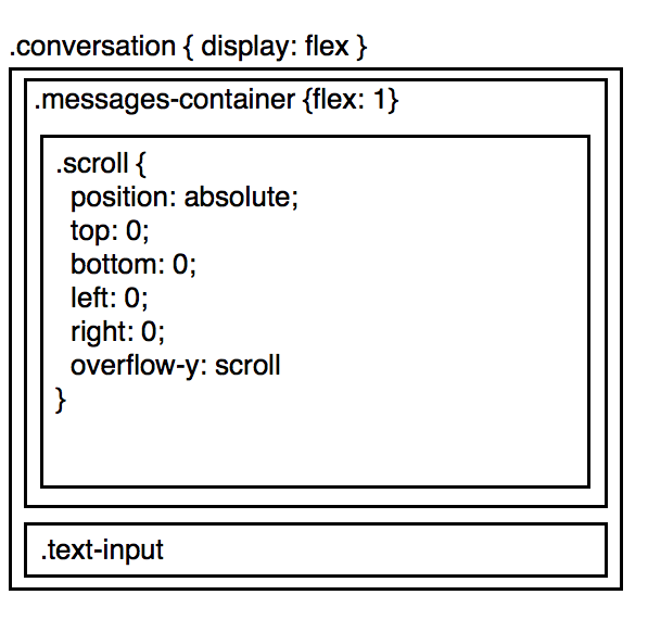
The idea here is to have the .messages-container take up as much of the screen as it can. Within .messages-container, .scroll holds the list of messages, and in case there are more messages then the size of the screen, scrolls.
Now, consider this case:
- The user scrolls to the bottom of the conversation
- The
.text-input, dynamically gets bigger
Now, instead of the user staying scrolled to the bottom of the conversation, the text-input increases, and they no longer see the bottom.
One way to fix it, if we are using react, calculate the height of text-input, and if anything changes, let .messages-container know
componentDidUpdate() { window.setTimeout(_ => { const newHeight = this.calcHeight(); if (newHeight !== this._oldHeight) { this.props.onResize(); } this._oldHeight = newHeight; });}But, this causes visible performance issues, and it's sad to be passing messages around like this.
Is there a better way? Could I use css in such a way, to express that when .text-input-increases, I want to essentially shift up all of .messages-container